Purpose of this information
This information is designed to help you prepare a poster that meets the criteria for FIP congresses.
For your convenience, please download the pdf of the instructions below.
Overall layout
Most posters are laid out in the following segments:
- Title (Identical to the title of abstract; since some people may choose to visit your poster based on the abstract. See also below)
- Author’s names and affiliations
- Introduction
- Aims
- Method
- Results
- Conclusions (Keep in mind that the first thing most viewers will do is look for and read your conclusion so, make sure the conclusions section of your poster is easy to identify and read.)
- References (Use a smaller font size. Reference only the most relevant articles related to the work and/or on the work’s background and methods used).
- Contact details (e.g. email, phone number, website) and acknowledgements (These are optional but they should appear in smaller font size.)
Design considerations
- Size: The size of the poster boards is portrait and is be 0.95 meter wide X 225 meters high. We recommend to print the poster on an A0 format (84 cm x 119 cm or 0.84 meters x 1.19 meters),
- Title: It has been shown that text in capital letters takes 10% more time to be read than lower case text; so your title will be more easily read if it is in lower case.
- Choose a large font size for the poster’s title, author and company; not less than 72 points. Avoid fonts that mimic hand writing or are difficult to read. Arial or Times New Roman are usually a good choice. Use the chosen font throughout your poster: don’t mix up different fonts on your poster text.
- To facilitate reading, double-line space and justify all the text. The shorter and the simpler the sentences are, the easier your poster will be to read.
- Subtitles Allocate a specific color to the subtitles within the poster so that they will be better distinguished from the text.
- Important parts of the text may be highlighted using different colors. Major colors that are easily readable are:
- Black on white (or a cream colored background)
- Red on white (or a cream colored background)
- Green on white (or a cream colored background)
- Blue on white (or a cream colored background)
Figures
- All figures should include brief captions/legends. It is sometimes advisable to show on the figure what is the most important using an arrow, bubble or label.
- Use the same font throughout your poster (in both the text and graphics).
Tables are preferable when data sets are small. - Lines in graphics should be thin. Graphics should lean towards a horizontal format rather than vertical. Ensure that within graphics, the axes are properly labeled, including with units. Any symbols should be explained.
- Preference should be given to:
- Bar graphs or histograms for the comparison of two groups;
- Line graphs for the evolution of parameters;
- Pie-charts to represent a proportion within a whole.
- Use pictures or images of sufficiently high resolution in order to ensure good quality print. Be sure to use pictures without copyrights. Moreover, try to use images that are clear and of good color and contrast (not too dark, not too light). Photos may be used to illustrate the location of the study and or the tools used.
Poster tips
- Organise your poster with the starting point at the upper left corner and the ending part at the lower right corner.
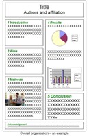
- Reading may be facilitated by indicating each of the poster segments (apart from the title) with a large number. The differentiation between the different segments could be shown with lines, bars or appropriate spaces. (See example image.)
- Posters are first of all visual presentations. As such, it is good to keep in mind that graphs, charts, photos or tables are particularly eye-catching. It is often considered that around 50% of a poster should be dedicated to illustrations.
- To increase the proportion of figures in a poster a simple method would be to think first of what figures, tables, etc, would be used if you had to describe your work only with visuals. Remaining items and ideas not covered by figures can then be added using text.
- Keep in mind that many FIP congress attendants are not native English speakers, so it is wise to use simple and clear words. Avoid abbreviations as much as possible.
After writing your poster
Print your poster A poster printed on one single large sheet is recommended.
Displaying your poster Think of your poster as a valuable piece of knowledge. Do not leave it unattended when travelling. Time slots for hanging up, being present and taking down your poster will be published on the congress website.Necessary materials for hanging your poster will be available in the exhibition area.
Maximise impact It is recommended that you produce handouts (maximum of two A4 pages) of your poster.Enable people to contact you, for example, by putting an envelope below your poster for interested individuals to leave their business card if they are not able to meet you at the poster exhibition.
Liability
All poster presenters are responsible for putting up and removing their own poster in a proper way. If presenters do not remove their poster in time, FIP is not responsible for any damage that might happen to the poster if it is removed by staff members.